I’ve been obsessed with my personal website. It’s not even about the views and impressions which I’m receiving. I have one subscriber on my mailing list from my website, and compared to internet writer standards, I am virtually non existent.
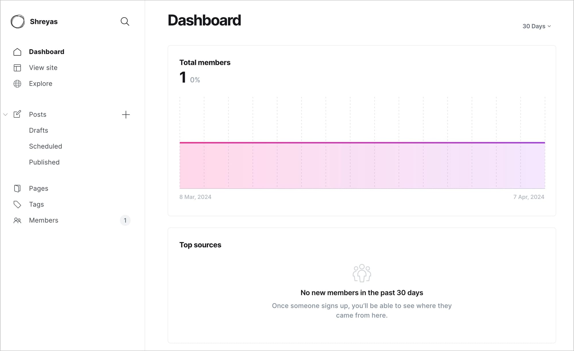
Yet, I care deeply about this little corner on the internet. It's a place where I optimise for depth over engagement and audience-building.
It’s my resume, my business card, my store, my directory, as well as my own personal magazine. It’s that one place online that I completely own and control.
As David Perell puts it, it's one's own intellectual real estate.
I’m obsessed with it enough to keep revamping my website every year. Just like the corporate re-branding exercises we’re familiar with, I do my own rebranding for my personal website. I reflect on what is NOW my personal brand. I sometimes redo the styling, the fonts and the formatting from scratch and start with a clean slate. I sometimes redo my writing based on my current thinking style and philosophy.
Previously, my favourite font of choice was Karla, then I switched to Poppins, Assistant, Inter, Helvetica Neue and now I'm falling in love with antique serif types (such as the one you see here in this blog)
Every time, I looked back at my previous work as depicted in my website, it felt shitty, and poorly done. But that was the whole point. The new version of yourself would never be satisfied with the previous work you've put in. I think @reidhoffman’s “If you're not embarrassed by the first version of your product, you've launched too late” applies well here.
I now had newer updated standards. My personal website updates have mapped my personal evolution over time, as well as my current standards of quality work.
My first website was a Tumblr blog containing a roll of all my photos under one roof. Back then, I identified myself as a photographer, and wanted to showcase this skillset to the world. Slowly, with more and more experiences, the labels which I used to define myself changed. Four years back, I was labeling myself as a ‘UI/UX designer’, and tried to showcase my love of design through my portfolio site on Wix. The objective of this site was to help in job conversions. I wanted recruiters to look at my website and ask for an interview. My way of achieving this was to put mountains and mountains of work online, and in public.
Whenever there was a reference to my previous work, I mapped the portfolio project links to keyboard shortcuts to make it easier to share with the headhunters on chat windows. And whenever I got an opportunity, I shared my screen, and took them through my work reel. I’d obsessively documented my work and my projects. And I was proud of it all.
A sure shot way to demonstrate my competence and core skills. Share widely, engage with peers. Debate/collaborate with folks who approach me through my website. Leave behind a legacy online.
And I waited for job offers to roll in. And it did!
My current role as a Product Manager at Noora Health was a result of this building-with-my-garage-door-open-stint.
I had my skin-in-the-game as well as my soul-in-the-game.
This year, I wanted to revamp my personal website with a focus on writing. I’ve been lately viewing writing as a form of thinking, and I wanted to condense and crystallize my ideas into one roof. I redesigned my website again with this brief in mind.
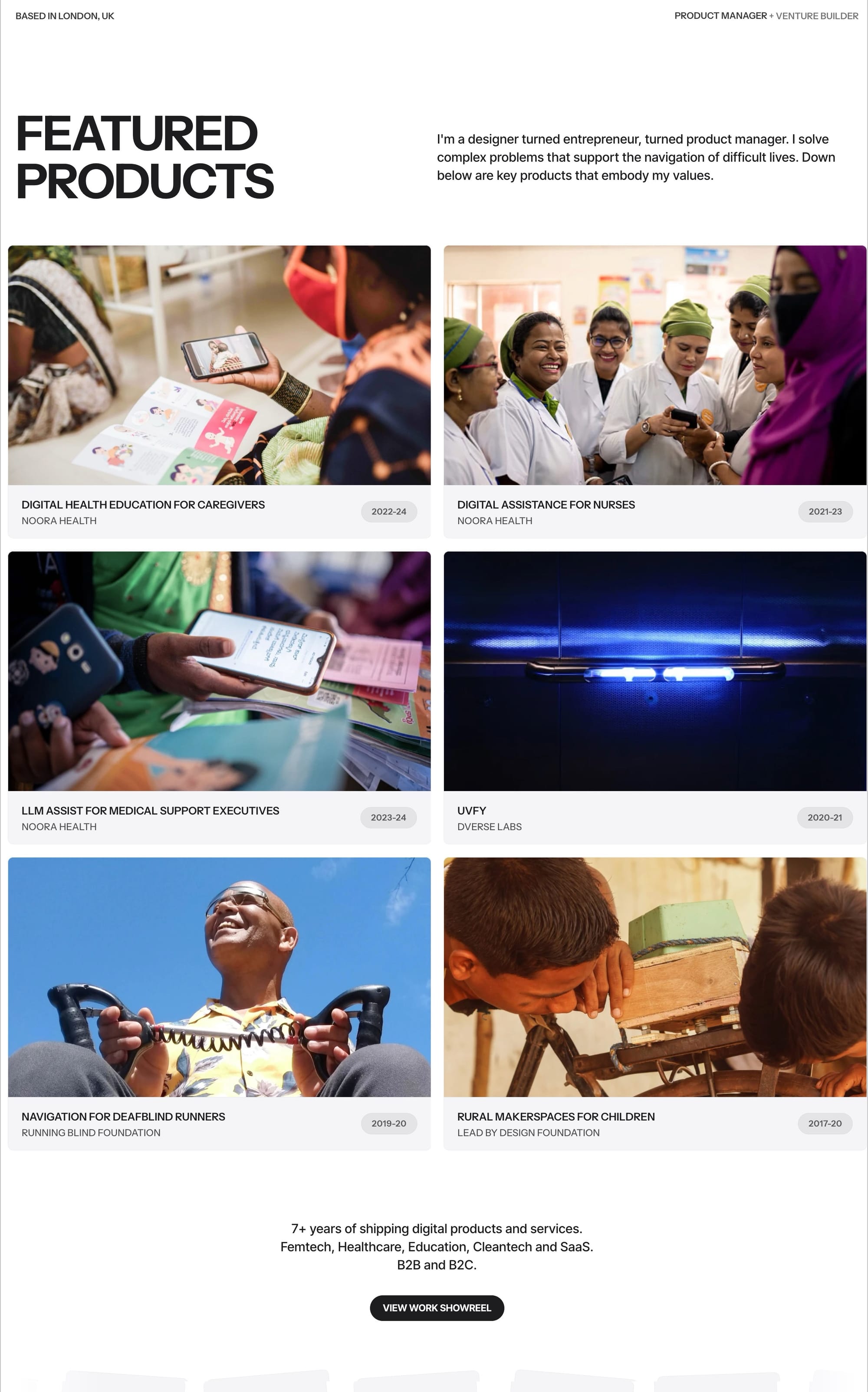
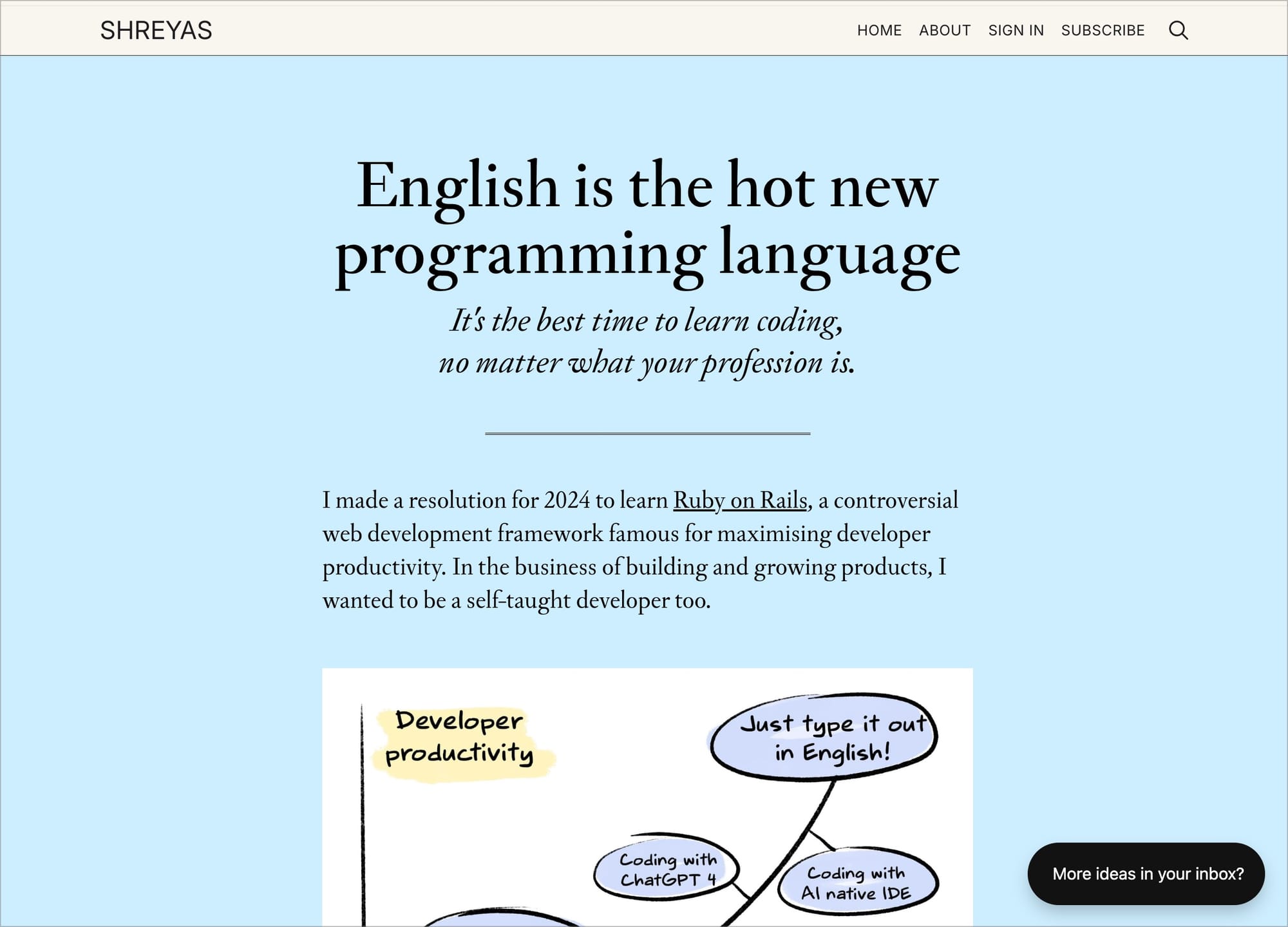
This was a setup I was satisfied until I realised how all those javascript animations and micro-interactions were killing the load time and performance of the website. It was at this junction that I discovered this site.
I wanted to make my site more 'simple'. So, I dumped the earlier direction of a '13 megabyte parallax-ative home page prepping for some awwward banner on the top corner of my site'. I just used simple HTML5 tags, deleted all the complex JS and checked the performance speed again.
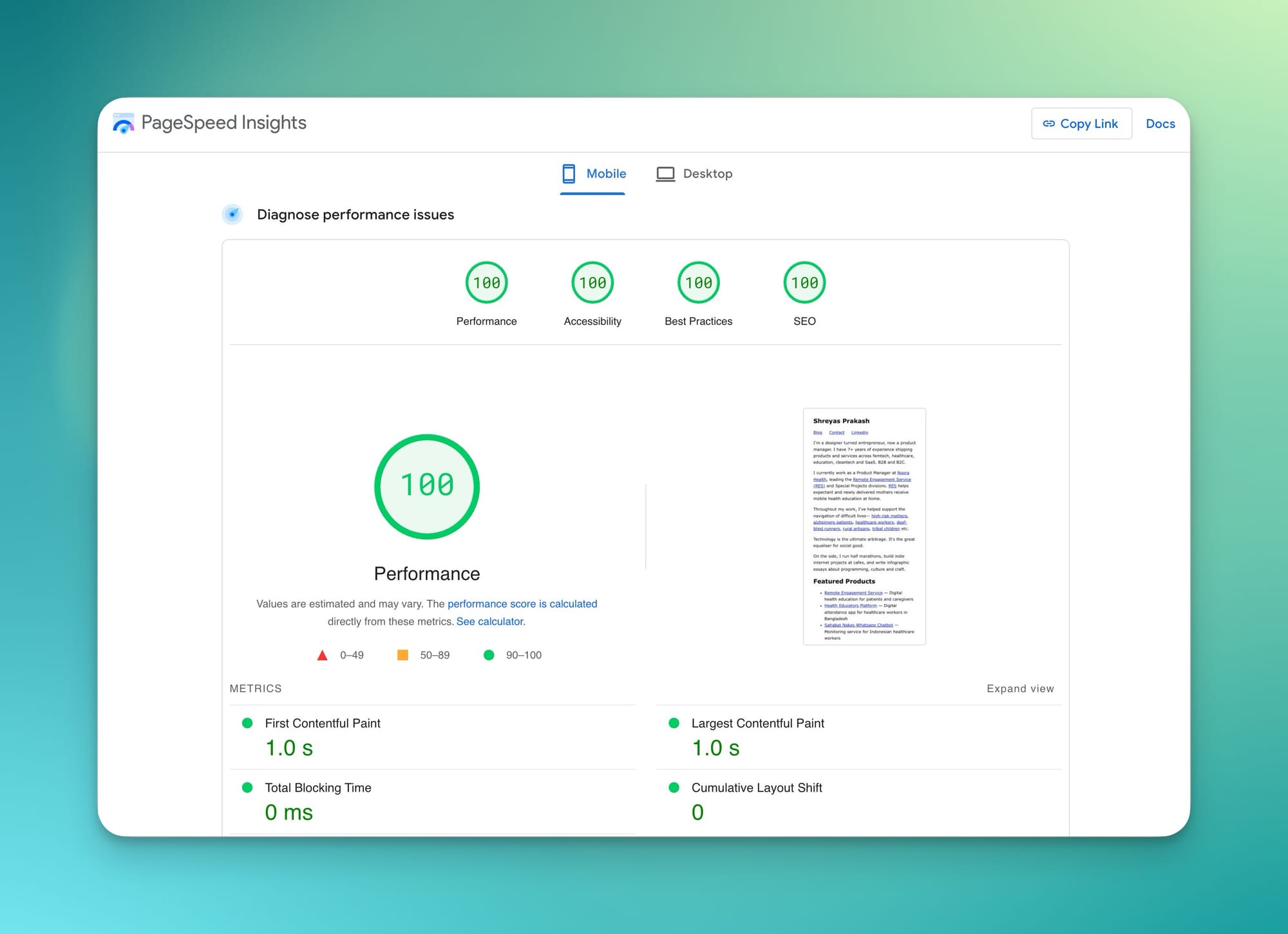
My current website reflects a lot of my ideals here. I dumped my original plan of making it more 'designerly', and went for simplicity instead. Simplicity is the ultimate sophistication.
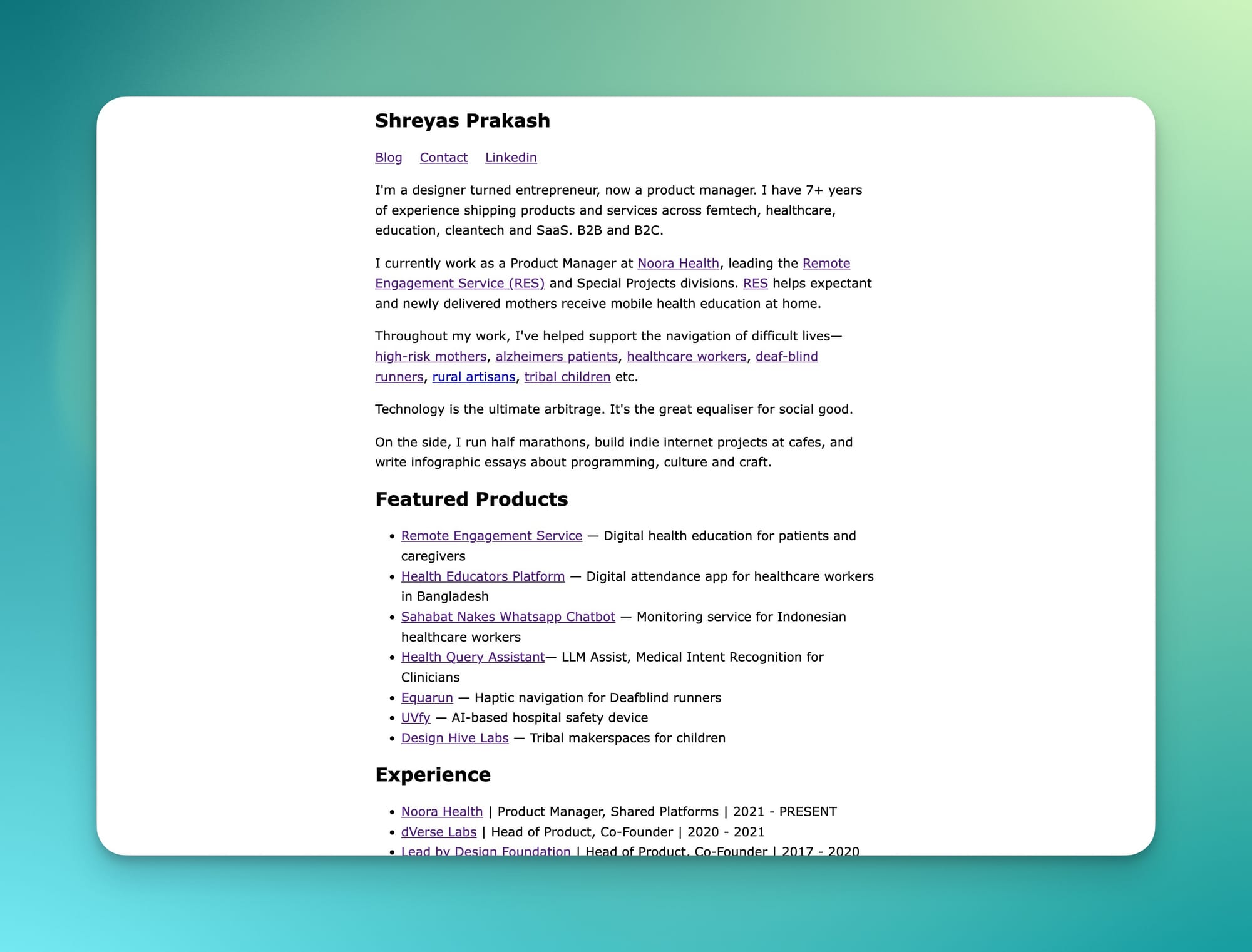
Simple not just on the front-end, but on the back-end too. The front end blog is hosted on Ghost, an open-source platform for publishing blogs. The blog currently points to blog.shreyasprakash.com, and I have wrapped it on my personal domain as an external wrapper. I’ve been an aspiring founder/hacker, and have started to care about why and how my blog/website is setup. Also planning to setup a /now page to talk a bit more about my daily diaries and current updates. It would serve more as a one-to-many social network where I could post more ephemeral updates.
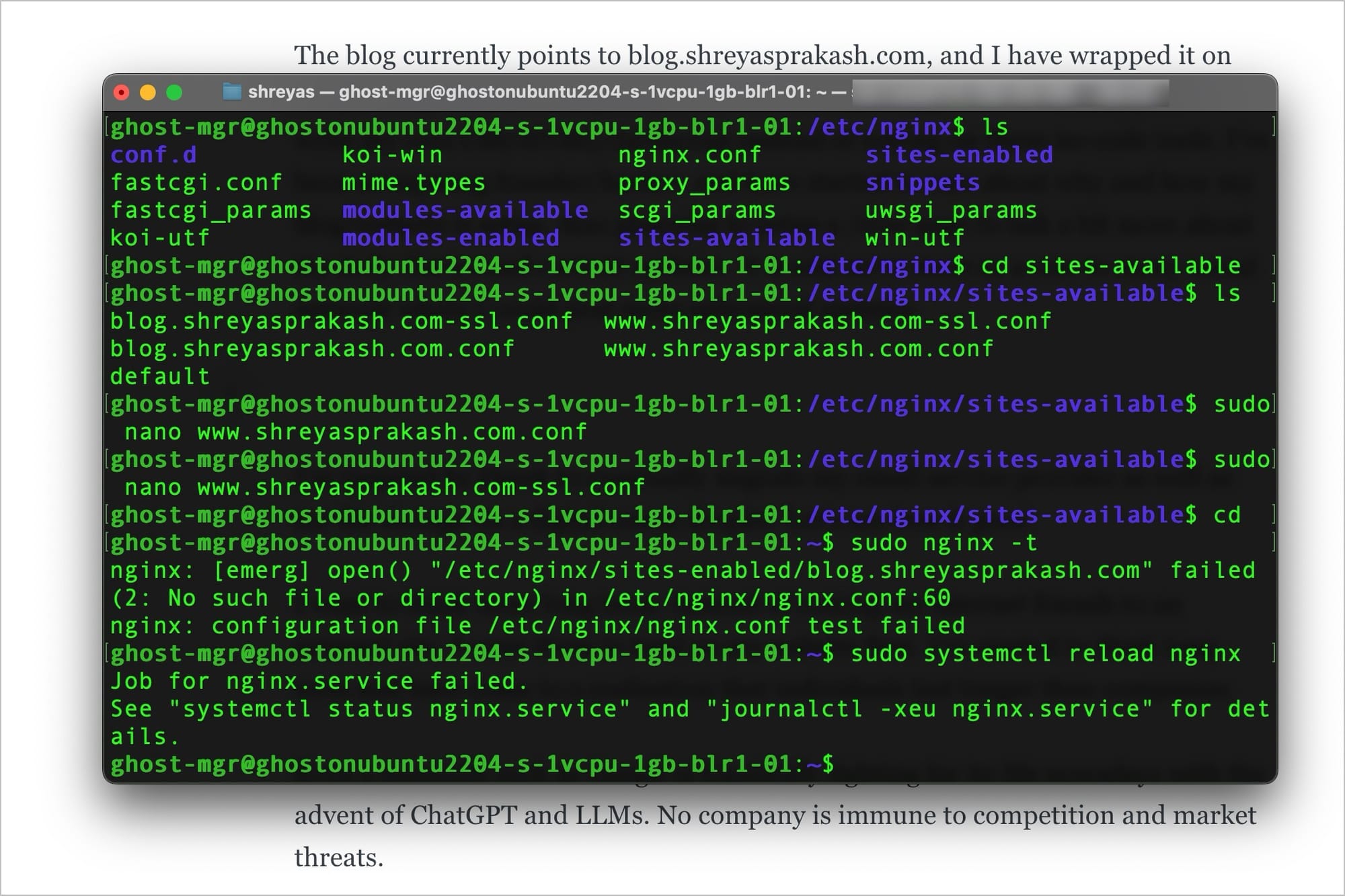
I’m inspired by Derek Sivers to eventually migrate my email service provider as well as my file storage on a digital ocean droplet. Let’s see how it goes!
Instead of routing my internet friends to an external site, I want them to land on my website first. I’ve started to think long term and have come to a realisation that individuals last longer than companies. With the emergence of ChatGPT and other large language models, even a giant like Google is actively contending with significant competitive pressures. This situation highlights that no company, regardless of its size, is shielded from market challenges and competitors.
I want my website to be a definitive place to get everything I create. I will still continue to put stuff on some other company’s sites (such as Twitter tweets). However, they would be secondary copies and not the primary source.
Eventually, I want this to be my 'root'. I can fork it wherever I want.
