Recently, a relative sought my help to tweak a badly designed poster on Microsoft Paint.
This was meant to be circulated on Whatsapp as an advertisement for the handyman services his friend was offering in his locale.

He wanted to ‘jazz’ it up and asked if I could help. I quickly fired my Figma and started working towards revamping the layout.
Before pushing some pixels, I took a brief pause—What if crappy design is sometimes good?
Does everything have to be 'designerly' with a better sense of aesthetic? I started searching online, and elsewhere for 'terribly bad but good design' examples.
Craigslist is an example of a successful company with a website that might make Dieter Rams roll in his grave.

Craigslist website is sprinkled with various UX violations. Lack of responsiveness. No clear hierarchy. Dense information architecture. Lack of contrast. Missing helper text for images. No advanced filters for search.
Despite all this, it's hugely successful attracting millions of users each month to put their local listings. And I'm inclined to think that the so-called 'crappy' design has played a role in achieving the business outcomes of Craigslist.
Part of the reason why it’s clicked is the bare-bones design which gives the impression that it requires minimal development and maintenance resources.
The 'crappy-design' effect makes Craigslist resemble a thrift store more than a high-end boutique, catering to users seeking affordable items.
Let's take another example.
Most of Japanese websites can also be considered under the 'terribly-bad-but-good' category.
Take Kakaku—A popular price comparison site with a text-heavy design displaying. Kakaku is not bad design, per se. It's just so different and unusual compared to western design principles. Just like several other Japanese websites, there is a lot of information condensed into a single page, with multiple columns and minimal white space.
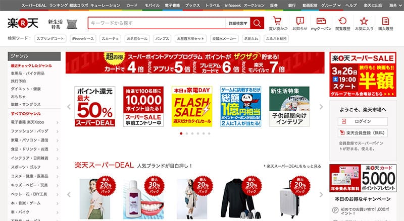
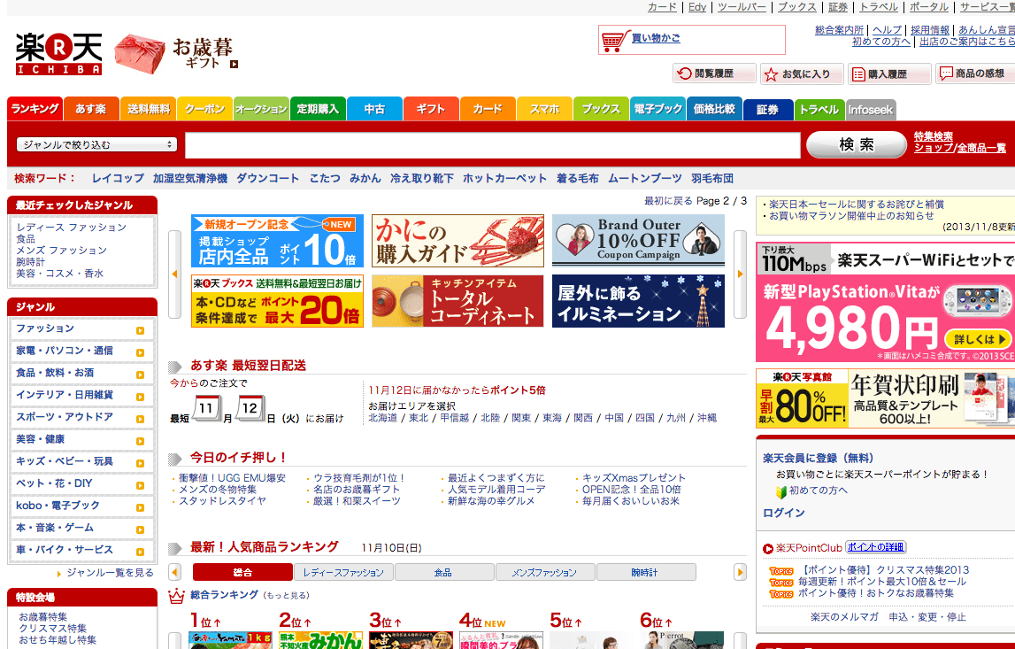
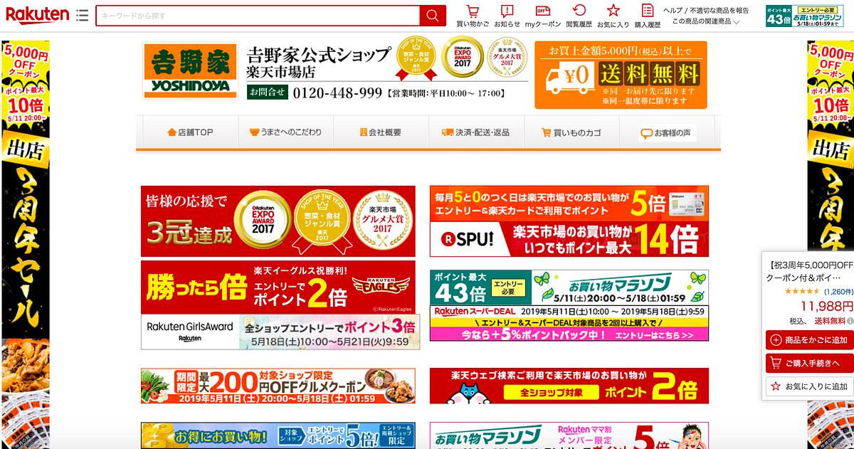
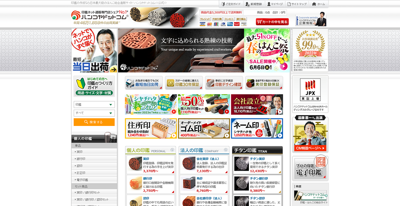
Dense nature of Japanese websites violating the usual western design principles
A video that inspired me to write this. Good design is a relative term and is subjected to the culture and context. What Japanese consider as 'good design' is way different compared to Western design principles.
The definition of what 'good design' means not only changes from region to region as shown in our earlier examples, but it also changes year to year.
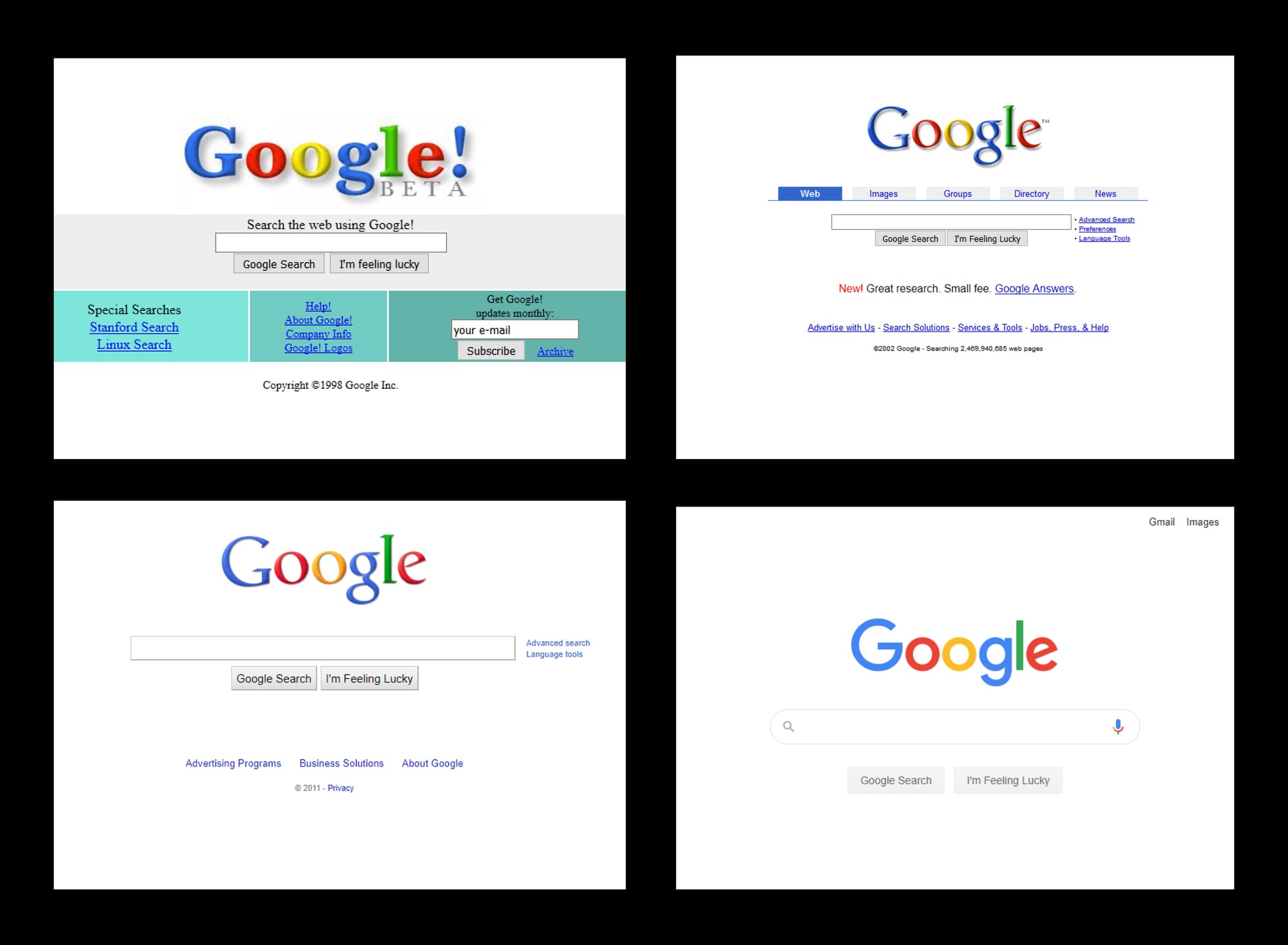

Coming back to the poster for handyman services. I'm beginning to think that there is a particular context in which even the current Microsoft Paint poster might fly well.
If I make the poster too pristine and professional would it then hurt the business? The opposite of what this poster intends to achieve.
If we work backwards from the business outcomes, the perspective around good design changes completely.
And sometimes, the design of the website can be so bad, that it's actually good for the business. Good design is a relative term. And context is everything.
