Brand treatments, Design Systems, Vibes
20 Sept 2024

The usual approach to building a design system often involves compiling a list of font families, typography guidelines, color palettes, patterns, and similar visual elements.
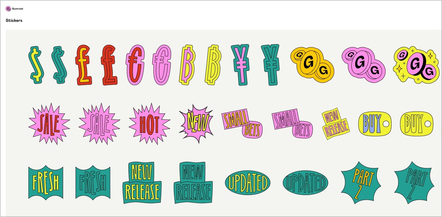
Take Gumroad, for example, one of the best open-source design systems out there. It seemingly covers everything a company might need—color schemes, icons, font selections, even sticker packs, and more.
When examining Gumroad, it feels as though something essential is still missing, despite its comprehensiveness.
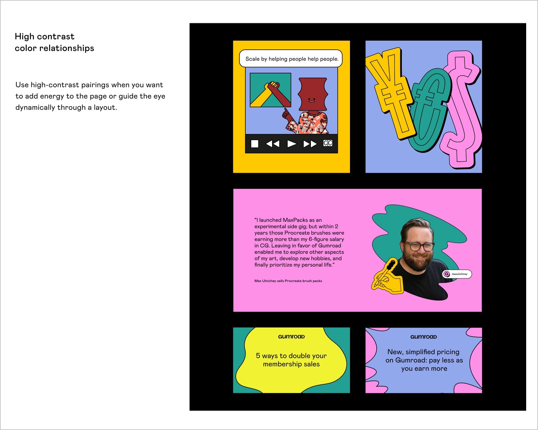
If a fresh designer who has just joined the Gumroad office wants to create a new landing page, or some creative assets for the social media, they might look at all these elements such as (font, color palettes, etc) in isolation, but would still not be able to get a complete understanding of how to ‘express’ the creative. What’s missing here?
I’d like to call the missing jigsaw puzzle piece as a ‘treatment’. A brand is not just about it’s elements. It’s about the treatments too.
The ant is different from the ant colony. The creative brand assets are more like the ant colony here. You would need more examples of the ant colony to truly express the brand.
Let me show some examples to demonstrate this trait of brand treatments.
mymind—a company known for its minimalist and visually distinctive approach—has adopted vinyl CD tracks as its UI for a music player. MyMind taps into the nostalgic associations of the groovy vinyl discs to create a unique brand treatment.
In contrast to a typical music player UI, you might expect clean lines, conventional buttons, and sliders. The focus is purely on functionality.

MyMind, however, uses the visual motif of vinyl CD tracks in its UI to evoke a different emotional response. By using a vinyl record’s circular track as a design cue, MyMind encourages users to slow down and engage with the interface in a more mindful and personal way.
Even their brand treatment when it comes to wallpapers is quite unique and distinct. All the right ingredients needed for a memorable brand.
Another example of a company that pays attention to brand treatment is Perplexity. They use the pinwheel as a conceptual motif to treat their brand in a totally different lens.

Pinning their brand on such an underlying metaphor, helps them to express their brand in unique ways. We’re used to seeing more visual motifs (such as the previous example), and with the rise of AI, we are seeing more unique brand treatments such as the one below where we’re also having conceptual motifs.

This is another example of them capitalising on this metaphor to arrive at a visual depiction for the “bicycle for the mind”.
Perplexity’s brand treatment through this ad where searching for knowledge is linked with bloom and prosperity through the use of flowers as a conceptual metaphor
Brand treatments might also be in the tiny details. Agora Governance also offers a great example of a brand treatment. The subtle shedding of leaves, sparks novelty and interest without grabbing too much attention.
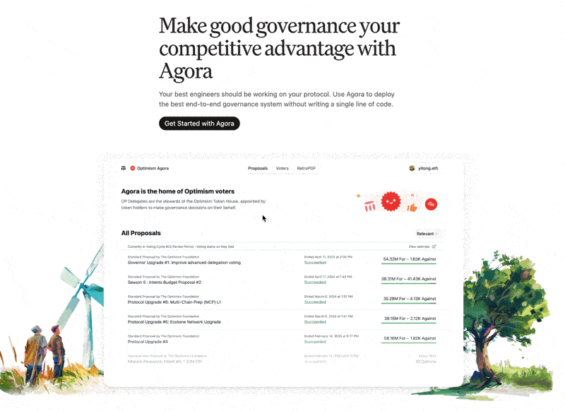
Agora Governance’s brand treatment involving the subtle shedding of leaves
Brand treatments also vary based on context and environment. For Google Pixel Watch dialface, Colophone Type Foundry designed a set of variable fonts that are accessible and expressive for four of its watch face design variations.

Some brands are so good that even the ‘vibes’ that they render are consistent and thematic. Inspired by Alexey Guzev, I’ve started documenting some of my own vibes which resonated here:
An ephemeral feed of vibes at /vibes under the home page of this site
A vision I have for the future of design systems is if these conceptual motifs, metaphors, traits and brand expressions could all be tightly defined and added to a company’s design system. This speculative design system might even capture/document the ‘indescribable’ vibes which also play a huge role. One day.
Read more
- 18 key ideas from reading Henrik Karlsson this monthwriting
- Stop arguing, and start drawing circles togethermathematics
- The whole world is just the snake eating its own tailmental-models
- Life lessons and hot takes from my 30slifestyle
- Building a skill for coherent science illustrationsscience
- My agentic engineering workflow (step by step)agentic-coding
- Hammock driven developmentagentic-coding
- Peculiar ways number three fits into our funny little brainsmental-models
- AI sandwich as a defacto principle for anything agentic engineering relatedagentic-coding
- Authority in the guise of evidencecritical-rationalism
- Map is not the territoryphilosophy
- Self hypnosis as a manifestation ritualmeditation
- Hegelian dialectic for structured reasoning with AI agentsphilosophy
- How I prepare for tough negotiations nowadaysnegotiation
- When should we steelthread somethingproduct-development
- Breadboarding, shaping, slicing, and steelthreading solutions with AI agentsproduct
- Healthy conflict in teams have a tipping pointteam-building
- How I deslopify AI writingwriting
- How I started building softwares with AI agents being non technicalagentic-coding
- Read raw transcriptswriting
- Legible and illegible tasks in organisationsproduct
- L2 Fat marker sketchesdesign
- Writing as moats for humanswriting
- Beauty of second degree probesdecision-making
- Boundary objects as the new prototypesprototyping
- One way door decisionsproduct
- Finished softwares should existproduct
- How I periodically rank my rough draftsobsidian
- Flipping questions on its headinterviewing
- Vibe writing maximswriting
- How I blog with Obsidian, Cloudflare, AstroJS, Githubwriting
- How I build greenfield apps with AI-assisted codingagentic-coding
- We have been scammed by the Gaussian distribution clubmathematics
- Classify incentive problems into stag hunts, and prisoners dilemmasgame-theory
- I was wrong about optimal stoppingmathematics
- Thinking like a shipmental-models
- Hyperpersonalised N=1 learningeducation
- New mediums for humans to complement superintelligenceagentic-coding
- Maxims for AI assisted codingagentic-coding
- Virtual bookshelvesaesthetics
- It's computational and AI everythingagentic-coding
- Public gardens, secret routesdigital-garden
- Git way of learning to codeagentic-coding
- Style Transfer in AI writingagentic-coding
- Understanding codebases without using codeagentic-coding
- Vibe coding with Cursoragentic-coding
- Virtuoso Guide for Personal Memory Systemsmemory
- Writing in Future Pastwriting
- Publish Originally, Syndicate Elsewhereblogging
- Poetic License of Designdesign
- Idea in the shower, testing before breakfastsoftware
- Technology and regulation have a dance of ice and firetechnology
- How I ship "stuff"software
- Writing is thinkingwriting
- Song of Shapes, Words and Pathscreativity
- How do we absorb ideas better?knowledge
- Read writers who operatewriting
- Brew your ideas lazilyideas
- Trees, Branches, Twigs and Leaves — Mental Models for Writingwriting
- Compound Interest of Private Noteswriting
- Conceptual Compression for LLMsagentic-coding
- Meta-analysis for contradictory research findingsdigital-health
- Proof of workproduct
- Gauging previous work of new joinees to the teamleadership
- Task management for product managersproduct
- Beauty of Zettelswriting
- Stitching React and Rails togetheragentic-coding
- Exploring "smart connections" for note takingwriting
- Deploying Home Cooked Apps with Railssoftware
- Repetitive Copypromptingwriting
- Questions to ask every decadejournalling
- Balancing work, time and focusproductivity
- Hyperlinks are like cashew nutswriting
- Brand treatments, Design Systems, Vibesdesign
- How to spot human writing on the internetwriting
- Can a thought be an algorithm?product
- Opportunity Harvestingcareers
- Everything is a prioritisation problemproduct
- How I do product roastsproduct
- The Modern Startup Stacksoftware
- In-person vision transmissionproduct
- How might we help children invent for social good?social-design
- The meeting before the meetingmeetings
- Design that's so bad it's actually gooddesign
- Lessons learnt interview prepping for product rolesinterviewing
- Obsessing over personal websitessoftware
- English is the hot new programming languagesoftware
- Better way to think about conflictsconflict-management
- The role of taste in building productsdesign
- Dear enterprises, we're tired of your subscriptionssoftware
- Products need not be user centereddesign
- World's most ancient public health problemsoftware
- Pluginisation of Modern Softwaredesign
- Let's make every work 'strategic'consulting
- Making Nielsen's heuristics more digestibledesign
- Startups are a fertile ground for risk takingentrepreneurship
- Insights are not just a salad of factsdesign
- Minimum Lovable Productproduct
- Methods are lifejackets not straight jacketsmethodology
- How to arrive at on-brand colours?design
- Minto principle for writing memoswriting
- Importance of Whytask-management
- Quality Ideas Trump Executionsoftware
- Why I prefer indie softwareslifestyle
- Use code only if no code failscode
- Self Marketing
- Personal Observation Techniquesdesign
- Design is a confusing worddesign
- A Primer to Service Design Blueprintsdesign
- Rapid Journey Prototypingdesign
- Visualise detailed file structures on CLIcli
- Do's and Don'ts of User Researchdesign
- Design Manifestodesign
- Complex project management for productproducts
- How might we enable patients and caregivers to overcome preventable health conditions?digital-health
- Pedagogy of the Uncharted — What for, and Where to?education
- Future of Equity with Ludovick Petersinterviewing
- Future of Ageing with Mehdi Yacoubiinterviewing
- Future of Tacit knowledge with Celeste Volpiinterviewing
- Future of Mental Health with Kavya Raointerviewing
- Future of unschooling with Che Vanniinterviewing
- Future of Rural Innovation with Thabiso Blak Mashabainterviewing
- Future of work with Laetitia Vitaudinterviewing
- How might we prevent acquired infections in hospitals?digital-health
- The why to endure any howentrepreneurship
- Design education amidst social tribulationsdesign
- How might we assist deafblind runners to navigate?social-design